- As seen on Under Consideration.
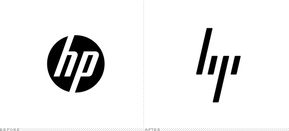
Sometimes a design is so well executed in its minimalism, there’s not much needs saying. HP has always struggled with being seen a stodgy, old and outdated. Their logo, the classic execution of letters in a corporate circle, embodied that.
Their new logo, based tightly on work by Moving Brands that was put together from circa 2008, shown publicly as a case study, but never finalised, is incredible.
It’s got obvious synergies with the old logo, just enough abstraction to be science fiction, and is filled with loads of symbolism or something so simple. It echoes binary, the 20degree angle connects nicely with concepts of URL and code slashes, while the block structure and spacing have some great use of negative space and connotations of connectivity. And best, there’s a certain ‘zen’ x factor to it due to the starkness of the overall approach – borderless, extensible. I love it.
And DAMN does it look good on the new laptop.
![]()
This hasn’t rolled out across the assets, and I’ll be curious if they retain this for their ‘premium portfolio’, similar to the role that Alienware now plays for Dell.
It would be a pity though, to hide something this strong away from the mass market.Visiting the HP site is a reminder of how soulless devices can be with bland branding of beige/gray and corporate blue.
